
Logotype is only a very small part of overall identity, but the most recognisable and tangible expression of brand and should be used properly at all times.
The primary logo is used in Delfi website, digital communication, social media and printed materials when a strong contrast between the logo and the background can be assured, e.g. on white and light grey background colours.


Primary logo on bright background
The preferred way to use the logo is on a white/light background. Every attempt should be made to do this in order to retain the integrity of the brand.

Primary logo on dark background
The preferred way to use the logo is on a dark background. Every attempt should be made to do this in order to retain the integrity of the brand.
Logo on white
The preferred way to use the logo is on a white/light background. Every attempt should be made to do this in order to retain the integrity of the brand.

Logo on black
If you are using a black or dark background on your communication, you may use the logo reversed out.
To protect the strength and integrity of the logo, a clear space area, free of competing visual elements, should be maintained.
-
 Primary logotype
Refers to the smallest size at which the logo may be reproduced to ensure its legibility in any print or screen media.
-
 Primary logotype
Always use a 0 degree angle. / Always use correct proportions of the logo. / Always leave the logo some space to breath. / Always use correct logo version on white or dark backgrounds.


Do not rearrange the logo. / Do not alter the proportions of the logo. / Do not change the logo colour. / Do not use the smaller logo than it’s minimum size. / Do not superimpose the logo on any image or background that makes it hard to see.


Colour is an integral part of the brand. This palette should be used in all communications, digital applications or any printed materials. Main brand colours are Dark Blue, Light Grey, Mint, White, Dusty Pink and Tangerine.
-
#0f134bDark BlueR:1 G:3 B:97C:100 M:100 Y:0 K:40Pantone: 2758 C/U
-
#f4f1eeLight GreyR:244 G:241 B:238C:0 M:0 Y:0 K:10Pantone: Cool Gray 1 C/U
-
#1bdab5MintR:27 G:218 B:181C:65 M:0 Y:45 K:0Pantone: 3385 C/U
-
#ffffffWhiteR:255 G:255 B:255C:0 M:0 Y:0 K:0Pantone: White C/U
-
#e5c6c6Dusty PinkR:229 G:198 B:198C:10 M:26 Y:17 K:0Pantone: 5025 C/U
-
#ff8048TangerineR:255 G:128 B:72C:0 M:62 Y:75 K:0Pantone: 164 C/U
Even though all four colours are main, Tangerine should be used as an accent colour in most cases and Mint should be used as often as possible.

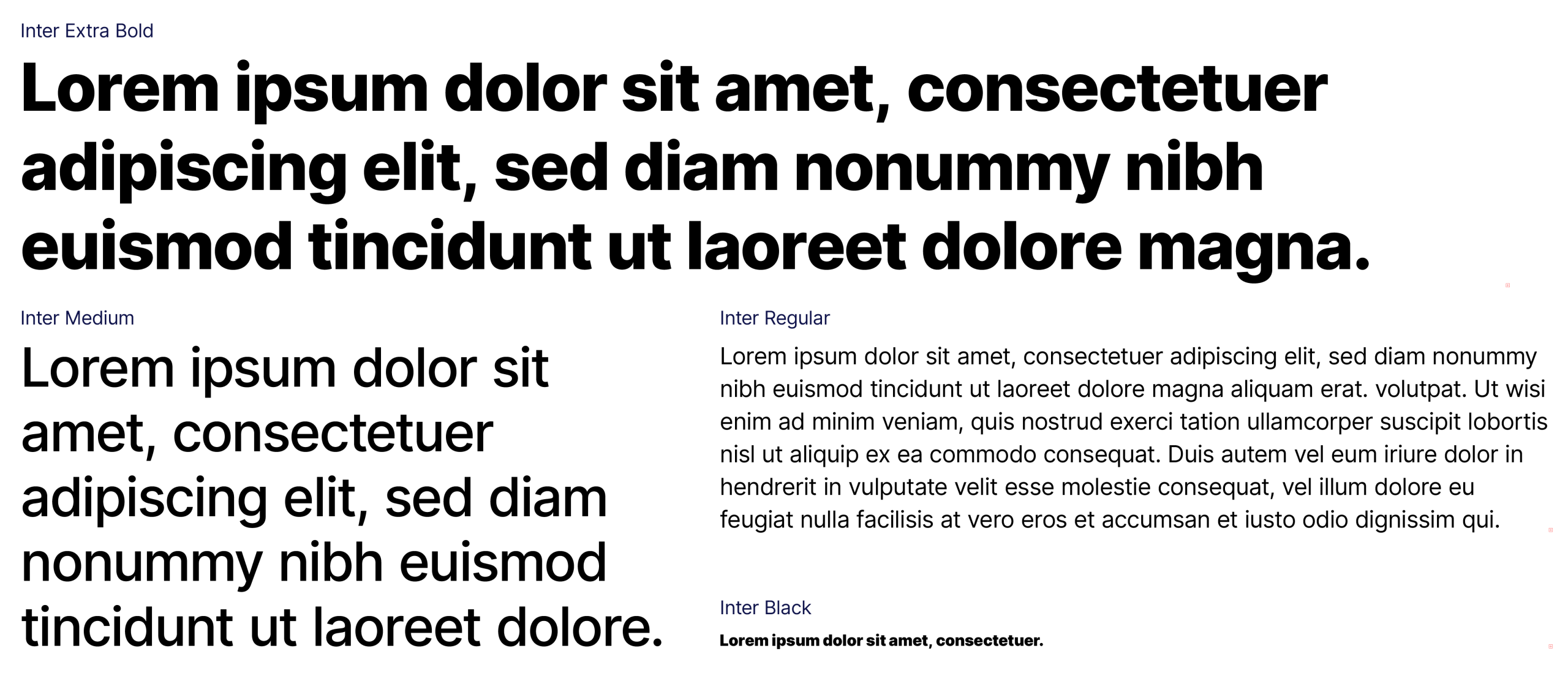
The aim of typography selection is to underline the unique character of the brand.
Inter Extra Bold is used for headlines. Inter Medium for subheadlines and Inter Regular for text blocks.
It is important to ensure legibility by setting character tracking, leading and kerning right.
Arial is a secondary system typeface and is used in exceptional cases only.
This typeface is installed on all computers and should be used in Word, Excel, Power Point presentations and other similar file formats.
This typeface is never used in external applications such as posters, leaflets, website, etc.

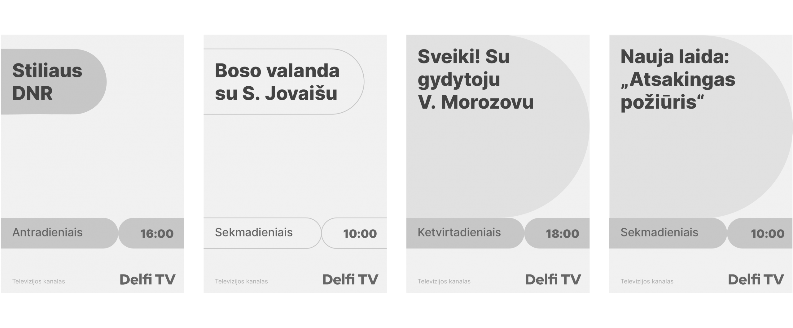
To fully broadcast the message, the brand uses graphic language that supports the principles already established by the logo. The following sections show some examples of how we use graphic element and icons along with grid, type and colour.
Graphic element comes from Delfi symbol and offers possibility to use it as a filled image carrier or as an outline graphic element.

This part gives both vertical and horizontal examples of how we use the elements.
Graphic elements are used to add the additional highlight on the identity. The elements could be framed.
The graphic element could be used as a space for pictures and filled with a specific colour. Layout could be photo-based with an outline, photo-based with element as a photo-carrier and illustration-based. It is important to leave some safety space for the logotype as it shouldn’t touch any elements.
Prints and outdoor layouts could be prepared in a variety of ways creating a sleek, clear, self-aware and functional visual approach while still remaining open and accessible. We use contrasted colours that works well in print.
Scheme:
Examples:

In the digital environment, we aim to represent the idea of users transition into digital format.
Download Horizontal & Digital layouts
Scheme:

Examples:

# joyful / open / easy-living / people-centric / fresh / accessible / friendly / positive.
